
Mairi Alice Dun in Conversation with Artist Jemma Powell
For British artist Jemma Powell, her pivot from a successful acting career—having featured in Tim Burton’s Alice in Wonderland, among other things—to her true passion: painting, has been a relieving act. As she says and her husband agrees, “I much prefer living with Jemma the artist to Jemma the actor.” Painting has allowed her to take control of her own artistic vision. Coming from a long line of artistic talents, Powell’s work captures landscapes in vibrant colours, often taking inspiration from past and future artist family members in the same works. She works en-plein-air, sketching out a landscape or street scene in the moment, then taking the unfinished canvas back in her in-home studio, where she will finalize the colours until they “sing” to her.
Powell recently sat down with MADE IN BED to discuss her third solo show, Words in Colour, which comes to Cricket Fine Art in London this summer. It will feature 40 new paintings created in the last 18 months from her travels back to her studio in the Cotswolds.
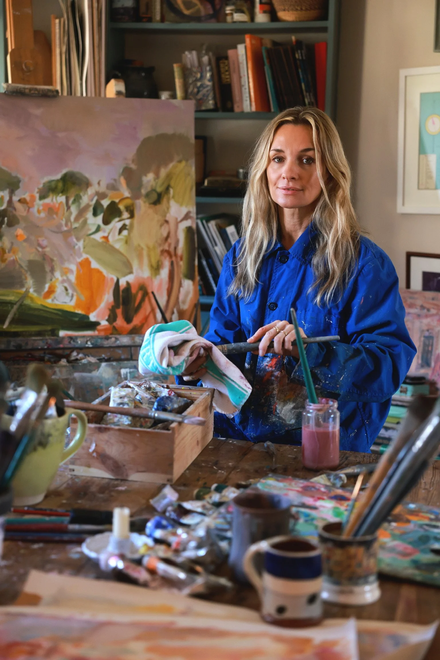
Jemma Powell in her studio. Photo courtesy: Gem Hall, the artist, and Sitwell Dearden PR.
Mairi Alice Dun: The title of this exhibition is Words in Colour. You’ve stated that you find it easier to use colour than words when expressing yourself. What are some of the things you're expressing, then, in the works in this show?
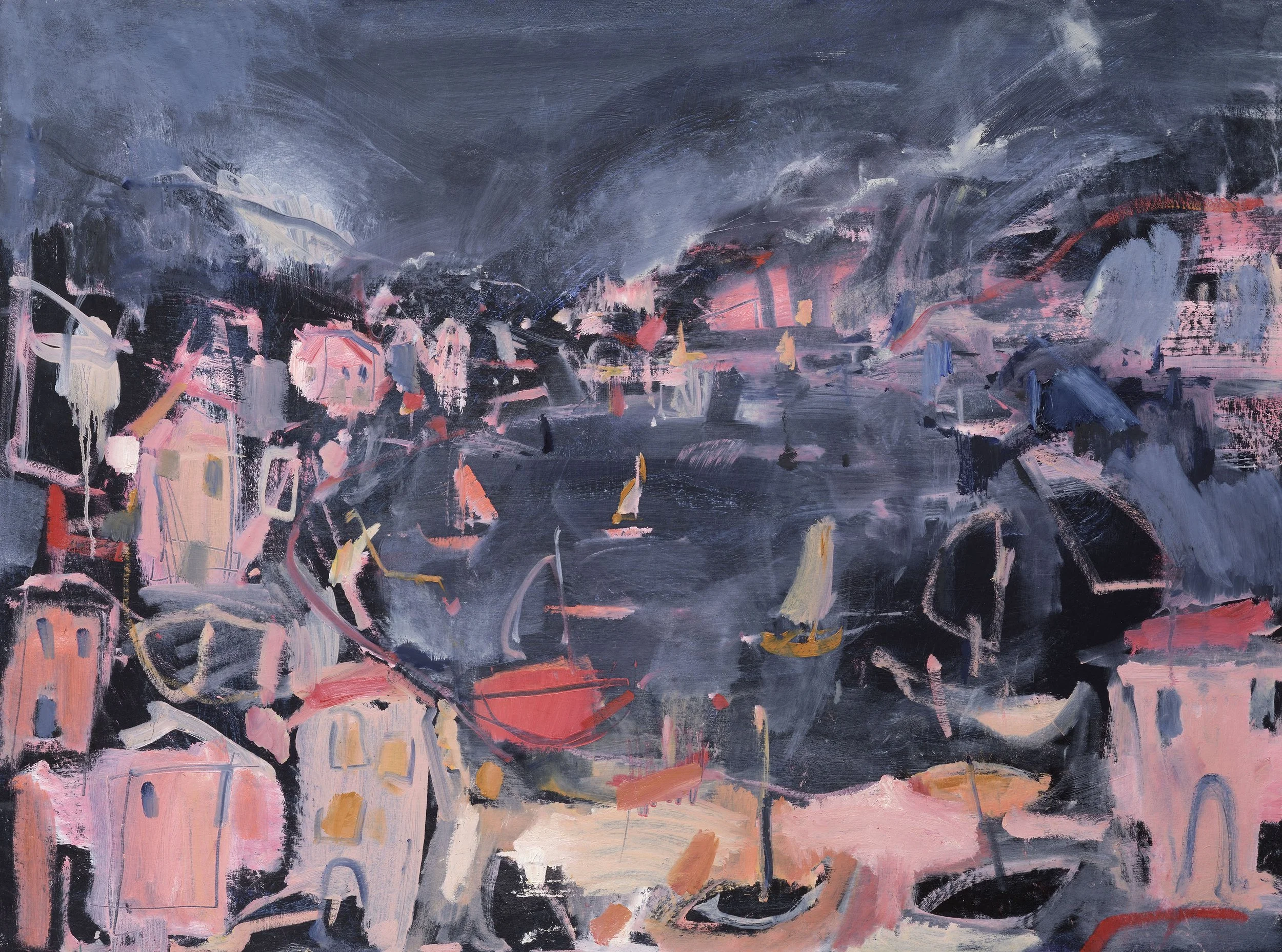
Jemma Powell: Often I'm trying to catch capture sounds and smells and light and, once I've got that all out [on canvas], it feels therapeutic. Call to Prayer is from my trip to Morocco, where suddenly the evening prayers go up in the minarets. It’s so overwhelming, but it's so beautiful as well. You're walking through the souks and there’s colour and the sound of the prayers and people rushing by. Then in The Grand Canal I am trying to capture the noise the lapping water and all the cries from people on the boats. Summer in Italy is the sound of crickets. I should maybe have called it Sound of Cricket instead.
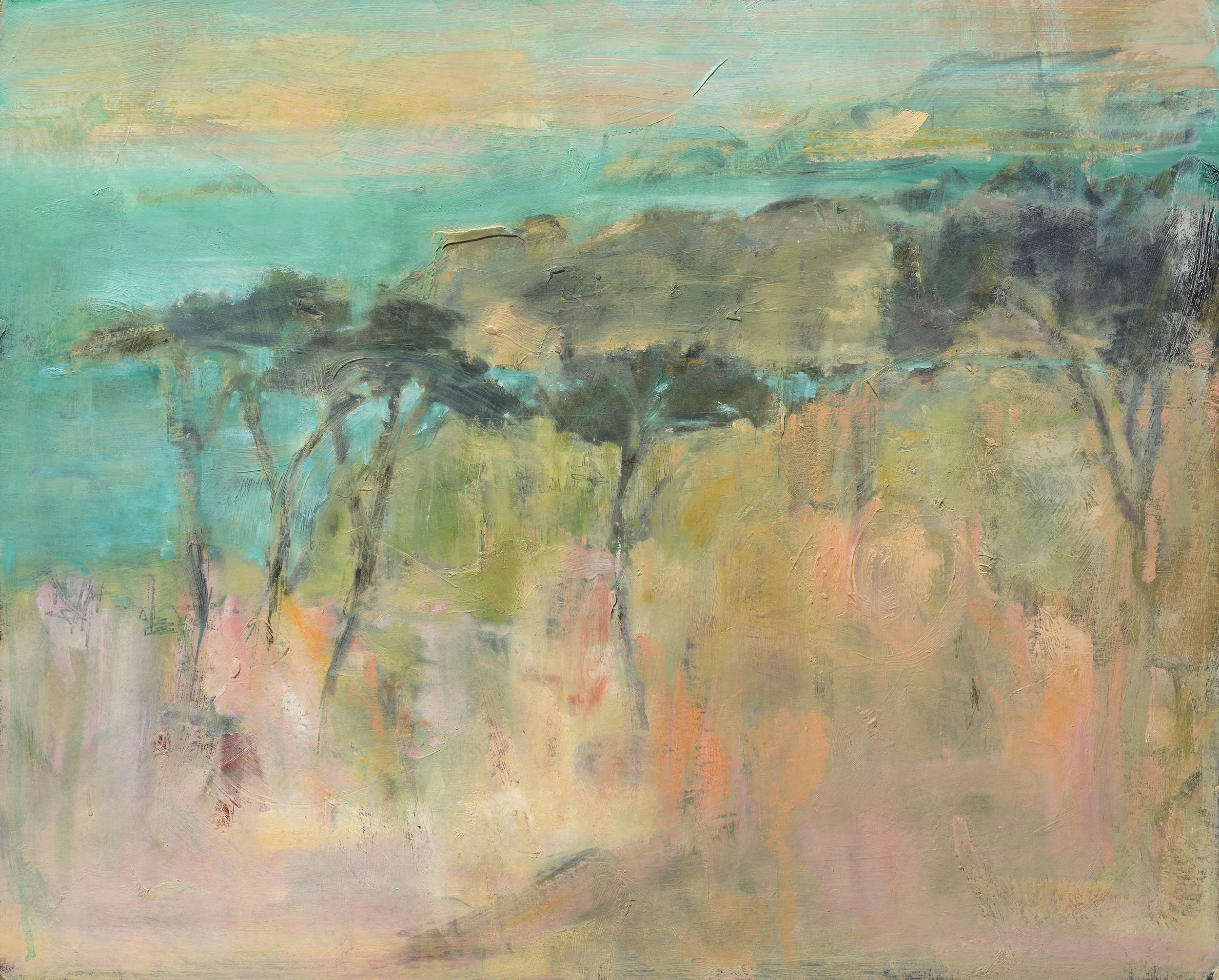
Jemma Powell, Summer in Italy, 2024. Oil on board 60 × 76 cm. Photo Courtesy: the artist and Sitwell Dearden PR.
MAD: I want to talk about your palette because it's very distinctive. Your mark-making can vary from a thicker impasto to a lighter, more Cezanne-y feel, but I think your palette is a through line. You definitely use a lot of the same colours.
JP: I think I really love certain colours that work together. This sounds a bit naff, but I think certain colours do sing when they're next to each other. I'm quite fussy about it. I want to have a gray next to slightly-orangey fluorescent pink. That for me is two colours that really work together, and that kind-of have a conversation with each other. It's like a feeling inside me where it's like: ‘Yes, that works.’
MAD: You have talked about painting as a meditative practice. Do you think that part of the meditation is the identifying, mixing, and finding of those colours?
JP: It's not always a thinking process. I think it's a real instinct. And then when I mix those colours, I'm just mixing them. I'm not even thinking, and then when it lands, I'm like: Oh, there it is. It's resolved. It’s a job-well-done type of feeling.
MAD: Do you go into your paintings with a specific scene in mind?
JP: It depends really. I don't really have any rules, so often it will be a specific scene, but sometimes it is just from my head. Weirdly, I painted this street scene of India before I ever went to Rajasthan. So it was imagined, but it turned out to be really similar to lots of places I visited. It was almost like a vision or a dream. It's quite spooky. Maybe it's a past life thing.
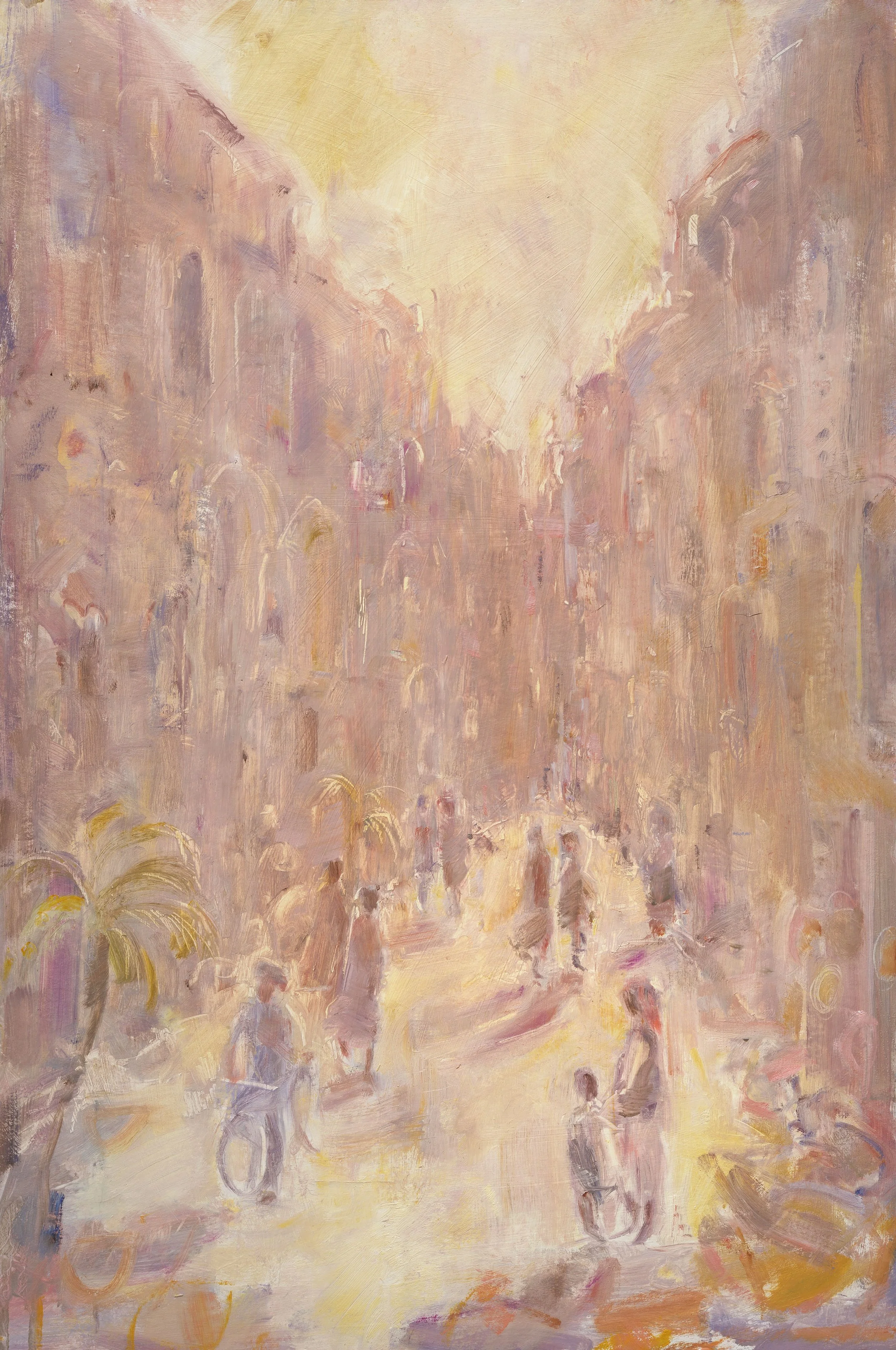
Jemma Powell, Street at Sunrise, 2024. Oil on board 76 × 51 cm. Photo Courtesy: the artist and Sitwell Dearden PR.
MAD: I think the pink you use is something that people really pick up on as well. I think it's very Vanessa Bell, but who would you say are some of your artistic inspirations?
JP: I would say the Bloomsbury Group definitely—I’m actually related to Sir Walter Sickert. There was this Royal Academist called Freddie Gore, his father was Spencer Gore, one of the Camden Hill painters. I actually knew Freddie. We hung out quite a lot, and I wrote my dissertation [on him] when I was doing A-level art. He would let me visit him, and we just got on really well. He was, like 95 years old and I was 17. He was so cool. He used to ask me about pop culture—the Spice Girls and things like that. He was just really interested in young people, and he knew how to connect with them, which was really quite unusual. I'd never met a really old person who could do that.
There's another sort of post-expressionist, Winifred Nicholson. She paints beautiful flowers. They're very pale. She was friends with Ivon Hitchens and she was a very domestic painter. She had lots of children, and she was just, I think, painting whilst looking after the children.
MAD: That’s an interesting through line too, because you also paint while looking after your children. Do you think that influences your practice at all?
JP: My children who are older are quite good at going, ‘Oh, mum's painting. Let's just let her have space.’ But my youngest one will come up and say, ‘Can I paint too, Mama?’ So I have to then get her paint stuff set-up. Then she paints, and then I paint. So, it definitely interrupts the process. My youngest, though, is amazing at drawing. I mean, she's four, but it's so incredible watching a child paint that way and to see her use of colour. But she grew up watching me paint, and so she's interested in colour. You can see it from such a young age: she'll get a brush and then just do a beautiful, long mark, and it's just deliberate and beautiful. Then, she'll pick another colour and it will sing with that other colour. Her mark making is insane. I've had to frame loads of her pieces. She's doing it so intentionally. It's just beautiful. So I have learned a lot from her.
MAD: This show was made over an 18-month period. Do you see an evolution or any change from the works in your past exhibitions?
JP: I think I'm having more of an understanding of colour, and that's why I did call this exhibition Words in Colour, because I don't think my mark making is necessarily there, but I love the colours that I use. Between the Wind and the Sails is better. It’s my favourite in the show. I think that that mark making is good and brave, and it's gestural. But there is an evolution. They're all just experiments, really. This year I really tried to group paintings together. This is how I paint landscapes, because if I go into the detail, it just looks ‘chocolate box.’ When I paint landscapes, I tend to go more abstract.
Jemma Powell, Between the Wind and the Sails, 2024. Oil on board, 76 × 101 cm. Photo Courtesy: The artist and Sitwell Dearden PR.
MAD: Is that the direction you'd like to head then towards, towards abstract landscape?
JP: I'm just quite figurative. I am. But I think I need to push myself to be more abstract. I'm doing an exhibition at a museum with my landscapes, and the curator liked those abstract ones. So that's really encouraging. I find landscapes really difficult, actually. I think I need to master the landscape. I need to keep pushing myself. The thing is, though, with street scenes what I love is the characters. I think it would be a shame to lose the people, because I think their bodies tell a story. Maybe it is about making the characters a bit more abstract as well.
MAD: How long does one work take to be finished, on average?
JP: People ask me this and I tell them: it’s a lifetime of looking. When I'm 98, I get to call my retrospective show a Lifetime of Looking. They can take weeks, and sometimes they can take a day. It is a lot of looking. Often, I'll look at a view, and I'll look at a view, and I'll look at a view, and I'll look for a year, and then I'll paint it. I know it so well at that point. I think it's just about finding the shapes. What's lovely about streets is that there are things that are recognizable that you really just pin on a painting, and then so that's just a load of colour, really. Then you can say, ‘Oh, those are people with a landscape.’
When it’s a landscape, you have got to really work to make a tree look like a tree. It's got to be a beautiful line, or it's got to be a beautiful ‘the right colour,’ or there's got to be a fluidity to it. So it's tough. I think it's the hardest thing to paint compositionally.
As Jemma Powell continues to explore the delicate balance between figuration and abstraction, between street scenes and wide-open landscapes, her work remains rooted in colour, composition, or the quiet gestures of human figures. With Words in Colour, she invites viewers to see the world through her eyes: vivid and sensorial. As she pushes her practice further, blending intuition with technical skill, Powell’s journey as an artist is only just beginning to unfold—one deliberate mark at a time.
Jemma Powell: Words in Colour, will be on at Cricket Fine Art in London from 18 June – 4 July, 2025.
Find more about Powell on her website or on Instagram.
Many thanks on behalf of MADE IN BED to Jemma Powell and Sitwell Dearden PR.
Mairi Alice Dun,
Editor-In-Chief, MADE IN BED