Rachel Hansen in Conversation with Philippe Halaburda
Philippe was born in Meaux, France. After graduating from the Art and Graphic Design School EDTA SORNAS, in Paris in 1995, he moved to Switzerland where his work was primarily figurative. He later moved to Aix-en-Provence where his oeuvre became increasingly abstract, light, bold and colourful. He ultimately transitioned into a playful, unpredictable abstraction of pure geometric forms and grids against white space. Now living in, and influenced by New York City, Philippe is evolving his style in exciting and innovative ways. His work has been compared to that of the Russian avant-garde artist, Kazimir Malevich (1878-1935), who pioneered the concepts of Suprematism and Constructivism, largely influenced by Cubism and Futurism. Philippe uses a multitude of mediums, including canvas, acrylic, paper, photo, digital media and plexiglass. His technique of replacing the traditional paintbrush with spatulas and colour tape allow him to create a unique visual code he continues to reinvent with great dexterity.
Rachel Hansen: You describe your work as a psychogeographic map. Can you explain this term to us?
Philippe Halaburda: Psychogeography is a term that was created in the 1950s by the French theorist, philosopher, Guy Debord. He founded the Situationist International movement. Every time we are in a specific environment we all feel a certain way, a particular emotional reaction, or even sometimes a physical sensation. To let our senses be more receptive, we need to allow ourselves to drift. But, for several reasons we are not fully aware of this state of mind. This is what I try to reach, represent and share through my art. As an artist, psychogeographic mapping is a way to visually represent and interpret all the physical and emotional reactions we don’t notice. I’ve named it geographic abstraction. All of these imperceptible interconnections generate maps with colours, codes and data. Some of us are more sensitive than others, but if you are, for example, in New York City compared to Paris, you may not notice but you don’t have the same feelings, energy or desires. I believe that the architecture, geography and topography of a city affect our senses and behaviors. I’m working on an abstract interpretation of these uncontrollable psychological effects.
Pannkinmarr 8, acrylic, felt tip coloured, pencil on paper, 61 x 48 cm (2018).
RH: After moving to Aix-en-Provence, in the south of France, you describe your work as having become lighter, bolder, and more organic. What was it about your environment that caused that shift? Now you live in New York City, how has your work transformed?
PH: It was mainly the natural light, the geography and the energy of Aix-en-Provence. All of these different subconscious elements affected my mood, my behavior, and of course my creativity. My art was definitely more organic, more connected to natural elements with a very light colour palette. Coming to New York was another change. For example, I don’t draw curves anymore because I see only straight avenues and streets. I started to only use strokes to reflect where I’m living. It also impacted my colour palette. The contrasts and colours in the city are much more intense and dark. Even in New York the natural light can be very beautiful; it’s a completely different visual ambiance, full of energy and chaos. All of these new sources are now part of my work.
RH: When you’re creating a new painting, does the space that you will ultimately showcase it in inspire the piece, or does the piece inspire the space?
PH: I often create with the space in mind. I did a series, for example, inspired by a network of pipes under the streets of Manhattan that I saw a few weeks earlier. I was in Chelsea where they were doing huge construction. I had this image of different types of pipes crossing each other, and it was visually impressive. When I started the series a few weeks later, I had these colours and this chaotic aspect in mind.
My work is a conscious or unconscious reaction to something that happened maybe a few months ago, a few weeks ago, or even a day ago. Most of the time I don’t even want to know what I’m creating, it helps me stay as authentic and sincere as possible. For example, when kids draw something they are totally free; they don’t care about aesthetics, rules or compositions. If they want to give someone green hair or draw a face with one eye, they don’t ask for permission. I believe there should be no limit in terms of creativity. I want to bring this level of liberty to my work – I want to be free. I still enjoy the surprise I experience when I discover what I’m making artistically.
A Perkkasa coral, acrylic, felt tip marker & pencil on stretched canvas, 63 x 63 cm (2019).
RH: Beginning a new work can be the most daunting part of the artistic process. What does your process look like? How do you conceive a new idea and begin putting it to canvas?
PH: When I start a new creation I don’t know what will happen. I don’t make any sketches and I operate in a very instinctive way. To keep spontaneity I work on different canvases at the same time. I try to lose control during each step of the creative process. It explains why I’m so interested in psychogeographical mapping – it’s my own psychological statement, my own psychological map of a precise moment.
When I work on a series of five to ten compositions, I aim to reach an accurate balance in each without controlling the steps to approach it. It’s like resolving a problem that I’ve created for myself. I always find a solution its just a question of time. My intention is to make each work different, but also complementary and connected to the others. When I face problems finishing a particular series, I’ve realized that starting a new one is sometimes the way to get the answer.
RH: How has your background in graphic design influenced your artistic practice?
PH: Graphic design has influenced my artistic practice in terms of composition and structure, even when I’m following my instincts as an artist. At art school in Paris in the 1990s, we did all of our work on paper by hand. Today, even with computers, I can use these “hand skills” to create a gesture of balance in my compositions.
Colours are also very important to me. My graphic design skills come through in combining and harmonizing them. I like to use colours in unexpected combinations, to create surprises, something unexpected, for me but also for the audience. For almost a year now I’ve used colour tape as a medium. I started to use tape because when people were seeing my work online they thought I was using [tape] to make all the straight lines. But no, I am able to draw those by hand with brushes and spatulas. A few years ago I tried using tape as a tool to make the lines and didn’t like it; it was not human enough for me, it was too perfect. But, reading all these comments about my paintings, I started to use and incorporate tape as a new material. What I can do with acrylic paint can be redone with tape. Visually, it’s a similar result, but the human presence is different. I like to renew my technique and redefine my style by trying new tools.
Sometimes a particular series of work deserves a new medium or new tool. For example, I attended a virtual residency last August with the goal of proposing something entirely new to my practice. I worked on a black surface with flashy colour tapes, but I quickly realized something was missing. After a few trials and some research I started to use tulle as a new element, and it was exactly what was missing. It’s a medium that I never imagined using in this context or situation. That was a real discovery and this is what I’m looking for as a creative person: to surprise the audience and myself. I don’t want to repeat myself. Every creation I’ve done in the past, I’m unable to do again; it was part of a specific moment and specific location.
Neonn Maaper, tape on black mounting board, 46 x 61 cm (2020).
RH: You have a series of paintings that incorporate QR codes onto the surface of the canvas; can you explain the meaning of these codes?
PH: My goal for this series was to find a way to interact with people through my work. Initially, I make art for me, but when it’s done it’s for the audience, for someone else. So, I’m always looking for a way to bring people into my work, to communicate and engage with them in a positive way. When I moved to New York, I took all these photos of different places in the city. I printed them on canvas and then painted them. The QR codes are all associated with specific locations in New York. You are able to scan them and watch a video, listen to a sound or discover photography online. I linked the codes because I wanted to give the audience the opportunity to go beyond the surface of the canvas. It’s also a way of proposing an abstract interpretation of these neighborhoods.
QuaRenon code 9b, acrylic, felt tip coloured & printed interactive QR code on white paper, 60 x 50 cm (2015).
RH: On your website and social media accounts you brand yourself as “Halaburda,” your last name. Can you tell us about this branding technique?
PH: My main goal is to present my work professionally. It’s important for people who discover my art to see a clear image of what I’m doing. As an artist I try to create my own identity, and given my graphic design background, I can manage myself almost like a brand. I want people to recognize my style quickly and think “ah yes, this is that artist.” My last name, Halaburda, is unique. I’m French but it’s not a common French name, so it’s nearly a perfect name for a brand.
RH: What role does social media, namely Instagram, play in curating your image, interacting with your following and promoting your work?
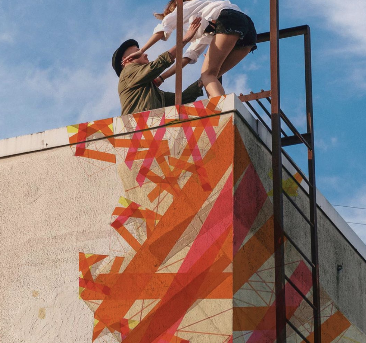
PH: Over the last five years I’ve used Instagram more and more. I post almost every day. For me, it’s like having a second studio. It means that I can show photos of the physical studio, myself, recent works, and also digital creations. By that, I mean it’s a great place for me to share and look for art projects. For example, I’m able to show people that I can make murals, optical installations or in-situ works. If I want to show these possibilities, I can design them on Photoshop with existing works in the form of a mock-up and simply share it. It’s the right combination of what is real and what can be done with my art. I can immediately interact with my audience and reach who I want to reach. It provides direct access to a lot of artists, gallery directors, art advisors, critics and magazines such as people like you at MADE IN BED, for example.
Halaburda, Instagram (2020).
RH: What does success look like to you?
PH: My success as an artist comes from staying free and being able to always create new things – to renew my style and myself. I don’t really want to be recognized; I just want to reach a level as an artist where I can totally live by my art. I used to be represented by several galleries in the U.S. and France, until 2018, but today I am not for reasons I couldn’t control. I’ve had to position myself as an independent artist. It pushed me to change my perspective and how I was interacting and positioning myself in the art world. This is a time for doing, promoting and selling my art differently. In the past, when I was represented, gallery directors never asked me to produce specific artworks; I was able to keep my freedom, which for me is very important. As an artist I want to keep my freedom no matter the cost of preserving it. It’s part of my creative process to experiment and always search for new things.
Thank you, Philippe.
Follow Philippe on Instagram, or visit his website.
Imagery courtesy of the artist.
Rachel Hansen,
Interviews Editor, MADE IN BED


![halaburda-studio[1].jpg](https://images.squarespace-cdn.com/content/v1/5dd5ba0cbccc005166d0887c/1604055849968-NW2HBHNU6VVVOKNAG961/halaburda-studio%5B1%5D.jpg)


