‘Perle Fine: A Retrospective’ @ Gazelli Art House
Perle Fine’s first UK retrospective is on view at Gazelli Art House. With works ranging from the early 1940s to the late 1980s, the exhibition is an overarching display of her prolific career as one of the pioneering female Abstract Expressionist painters. Her oeuvre is extensive and includes acrylic, oil, gouache, ink drawings, and mixed media works.
Fine, like many other great artists, was overlooked by critics as well as the market while she was alive. She has received great praise post-mortem, especially in the US–her home country. A teacher and scholar as well as an artist, Fine was obsessed with her craft. Even after being diagnosed with Alzheimer’s in the late 1970s, she continued to create work until her death in 1988.

Perle Fine, Accordment Series, A Timelessness #8, 1977. Acrylic and oil on linen, 152.4 x 223.5 cm.
A Timelessness #8 from Fine’s Accordment Series is one of the largest works on display at Gazelli Art House. Her Abstract Expressionist work has quite a range. Dealing with the geometric, as well as shapes that are often biomorphic, the exhibition displays the vast degree of variation in Fine’s oeuvre. A Timelessness #8 demonstrates her mastery of geometry and symmetry. The graph-like composition is intricate, with her use of multiple horizontal lines contrasting the single vertical lines. The jagged edges of the painting disrupt its perfect symmetry, adding an air of disjunction to the composition. This is further emphasised by her use of warm and cool tones, creating a conversation between the lines. Fine’s masterful use of colour, as well as composition, creates compelling Abstract Expressionist works which truly define the genre.
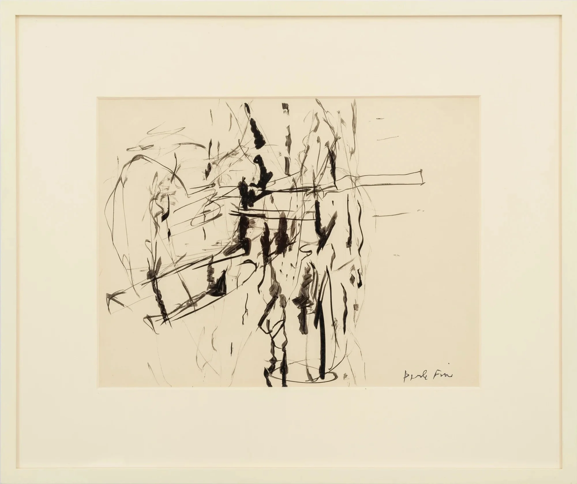
Perle Fine, Untitled, 1958. Ink on paper, 35.6 x 48.3 cm.
Fine’s earlier works like Untitled (1958) show the foundations of her career and the gestural movements which Abstract Expressionism was founded upon. Although she was known for her knowledge and use of colour, the inclusion of some black and white pieces forms a deeper appreciation of her intentionality. Her gestures are fluid yet firm and show an understanding of composition. The lack of colour encourages strong engagement with her gestural work without the augmentation of her masterful use of colour. The work is compelling, drawing the eye of the viewer, and her playful use of shapes results in biomorphic forms and churns out viewer interpretations. These earlier works created the foundation which would cement Fine’s place in the early Abstract Expressionism movement, although, at the time, she was not recognised because of her gender.

Perle Fine, Theme: Blue, 1948-1949. Oil on canvas, 109.2 x 94 cm.
Theme: Blue is mesmerising and further demonstrates Fine’s keen eye for colour. Different shades of blue rhythmically offset her jagged geometric shapes. The texture produced by her paint application heightens the relationship between the blue hues while also producing an almost collage-like element with the scattered shapes. Her use of colour provides a depth that makes Theme: Blue’s composition rich and compelling to look at, causing the viewer to fall into the work when viewing the painting. With this being one of Fine’s earlier works, we can clearly see her love of colour and inspiration from geometry and collage. This developed even further throughout her career, resulting in her later works like Cool Series, which she described as a “growth” rather than a “departure” from gestural abstraction into a more reductive, geometric approach to painting.

Perle Fine, Untitled, 1957. Collage, ink, and oil on graph paper, 21.6 x 27.9 cm.
Fine’s Untitled (1957) is another tribute to her range as she strayed from painting and involved collage in her practice. The work displays a playful earlier endeavour of Fine’s practice. Her work with collage adds something unique and experimental to her oeuvre and combines multiple elements which are present throughout the exhibition, thus providing context for additional works. Her use of blue is prominent and this can be observed throughout her retrospective as most of the works feature blue as the principal colour or, at least, as a supplementary colour. Blue was fundamental to her practice and has been used in many Abstract Expressionist works to provoke emotion. The use of graph paper recalls A Timelessness #8, which was produced twenty years later–her original inspiration clearly on full display.

Perle Fine, Calligraphy of Rhythms, 1950. Oil on canvas, 73.7 x 91.4 cm.
Fine’s Calligraphy of Rhythms is a standout. Quite large in size compared to some of Fine’s other works, it demonstrates that she can excel in both large-scale and small-scale forms. When looking at the painting, it’s surprising that only oil paint is used; it’s encapsulating because of its texture combined with a muted colour palette. The produced effect is so rich and grainy that it looks almost like sand–a tribute to Fine’s love of experimentation with texture. Throughout the retrospective, we can see her manipulation of textures and materials to create complex and evocative works. Here, Fine’s use of a muted colour palette is slightly atypical of her usual works which often feature brighter colours. Adept use of neutral tones is a powerful aspect of any artist. To create a work that is rich and engaging without the boost of bright colours truly speaks to Fine’s own artistic skill.


Fine’s first UK retrospective was a great success. It’s refreshing to see the forgotten masters of the Modern period being brought to the forefront and put on display. During her time, as Abstract Expressionism was largely dominated by men, Fine was vastly overlooked as she produced compelling work that was defining of the genre. The exhibition’s range brings together a well-rounded collection of Fine’s work, all of which demonstrate the mastery of her craft.

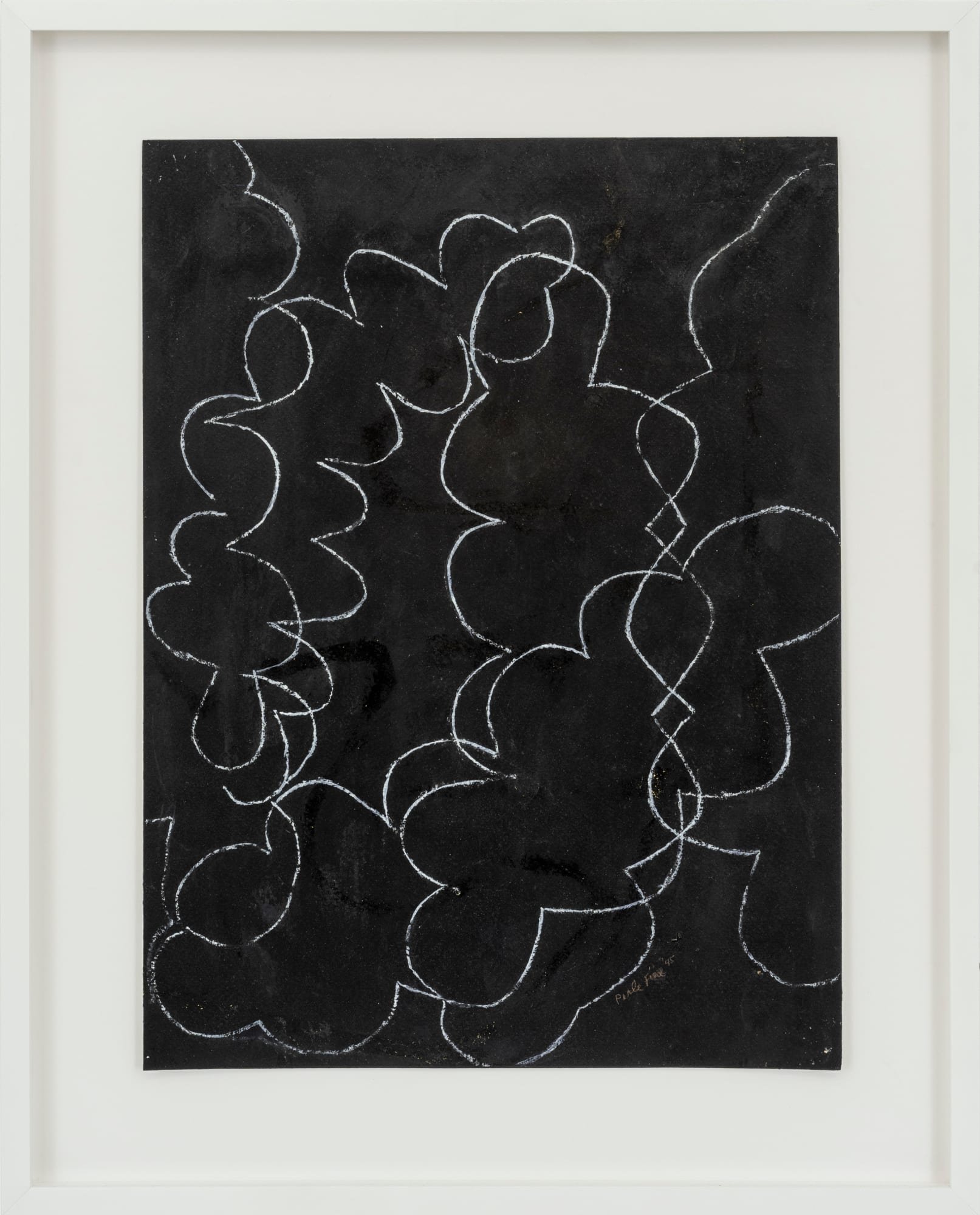
Perle Fine, Cool Series No.44, Double Square, ca. 1961-1963.
All images courtesy of Gazelli Art House and copyright to the Estate of Perle Fine.
Perle Fine: A Retrospective is on view at Gazelli Art House until 25 June 2022. To take a virtual tour of the exhibition, click here.
Hannah Savage
Reviews Editor, MADE IN BED